
Neutral Aesthetic iPhone Themes & App Icons
If you’re still struggling to figure out which aesthetic best suits your (and your iPhone’s) personal style while using the latest Apple iOS 14 updates, not to worry!
If too many colours or even basic black and white isn’t really your style – you may be interested in choosing a neutral colour scheme.
Neutral colours consist of soft shades of browns, beiges, greys, and whites; making it the polar opposite of the bold contrasting black and white aesthetic or overly vibrant and frenzied multi-colour palettes.
For some, brown and beige tones are dull and boring, but with the right app icons, fonts, and layout, neutrals can transform into so much more.
The neutral aesthetic is often associated with the minimalistic design movement with its clean and simple visuals as well as its preference of healthy, natural, and sustainable choices.
It evokes the Scandinavian design heritage where clean lines and the “less is more” mindset are its key characteristics.
This design philosophy also resonates with Millenials and Gen Z’s, especially those who are currently overwhelmed at work, with (pandemic) life in general and those yearning for a fresh start.
The “less is more” approach includes decluttering and removing unnecessary items that are unconsciously weighing you down.
If you find yourself easily distracted by the items around you, making it feel as if you can’t get anything done, the neutral theme works best.
The blend of organic tones helps make you feel more grounded to the earth giving you the stability, complimenting the airy feeling the lighter colours give off.
Carry it over to your physical workspace, giving you the room you need to breathe freely and think clearly and work effectively.
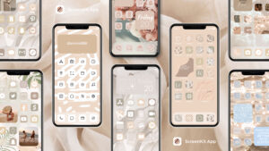
The same can be applied to ScreenKit’s neutral theme.
The light colours match each other perfectly, making your Phone seem fresh, organised and uncluttered.
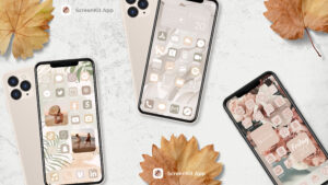
The soft shades will also help you smoothly transition between apps boosting motivation and productivity.
Overall, the natural colours work very well at refreshing and calming you down — as if you just entered a zen garden.
Of course, this might not be the right vibe for everyone so again, no worries if it doesn’t suit your taste.
It all depends on your personal preference so we encourage you to experiment and play around with the different colours and choices found in ScreenKit.
 Explore the endless amount of themes and aesthetics with ScreenKit to fully enhance your home screen experience.
Produced by Twinstar Creatives, ScreenKit is the #1 iOS 14 customization app found on the Apple App Store today.
It comes with over 100 different themes and styles to jazz your gadget up.
Make a stack of personalized widgets, icons, and themes with over 5000 design elements to choose from – without using Apple’s Shortcuts app.
ScreenKit’s 1-click special theme installer is also a time-saver, installing your chosen look at a fraction of the time it would typically take.
Download ScreenKit today, it is free to use with regular weekly updates for you to enjoy.
👇👇👇👇FREE DOWNLOAD SCREENKIT APP (PRESS BLACK BUTTON BELOW) 👇👇👇👇